Data + Methodology
Definitions
Home Owners' Loan Corporation (HOLC)
The HOLC was a U.S. government agency established in 1933 as part of the New Deal response to the Great Depression. Its primary mission was to assist homeowners facing foreclosure by refinancing their mortgages. However, it is infamously known for its role in institutionalizing redlining, a discriminatory practice wherein neighborhoods, often with large minority populations, were designated as high-risk for loan purposes.
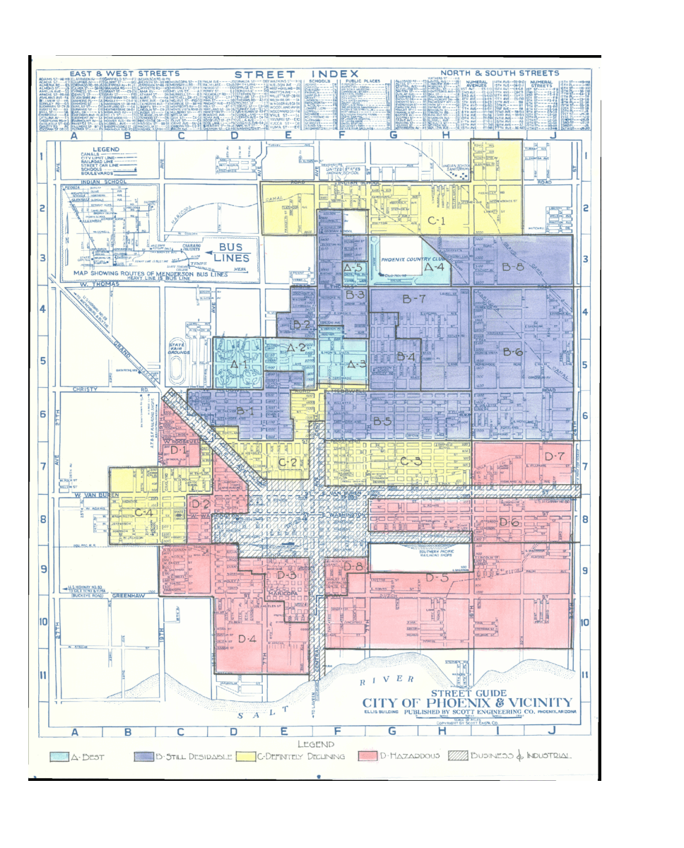
The Home Owners' Loan Corporation utilized a grading system for neighborhoods which consisted of four designations: A, B, C, and D. Each grade reflected HOLC's assessment of the neighborhood's desirability and creditworthiness:
- Grade A (Green): These were deemed the "Best" areas. They were typically newly built, affluent neighborhoods, often located in the suburbs, with residents predominantly being white.
- Grade B (Blue): Deemed "Still Desirable," these neighborhoods were a mix of older and newer homes. The areas might have been somewhat dated but were still considered stable and without significant "objectionable presence."
- Grade C (Yellow): Termed "Definitely Declining," these neighborhoods often had older homes and were more racially mixed. Lenders considered these areas as less desirable, making loans more difficult to obtain or having less favorable terms.
- Grade D (Red): These were the "Hazardous" areas. They often had the oldest homes, were proximate to industrial areas, and had a considerable population of ethnic minorities, particularly Black residents. The term "redlining" is derived from this grade, as these neighborhoods were often outlined in red on HOLC maps. It was challenging, if not impossible, for residents of these areas to secure mortgages or loans at reasonable rates.
Land Surface Temperature (LST)
Land Surface Temperature (LST) represents the temperature of the Earth's surface and is a crucial metric obtained from remote sensing data, especially in the context of understanding urban heat and microclimates. Unlike air temperature which is commonly measured by weather stations at a standard height above the ground, LST provides a direct measure of the heat emitted from the ground, buildings, and other surfaces. In urban areas, LST can vary significantly across short distances due to variations in land cover, with built-up regions typically registering higher temperatures than vegetated areas. Monitoring LST is vital for urban planning and environmental health, as high LST values can exacerbate heat stress on populations, affect local air quality, and influence energy consumption patterns.
Normalized Difference Vegetation Index (NDVI)
The Normalized Difference Vegetation Index is a remote sensing metric used to quantify and monitor vegetation health, density, and greenness from multispectral imagery, and it's crucial for studies spanning both natural environments and urban areas. It is calculated by taking the difference between the near-infrared (NIR) and red reflectances and dividing by their sum: NDVI = (NIR - Red) / (NIR + Red). NDVI values range between -1 and 1. In urban contexts, where vegetation is intermixed with built structures, NDVI serves as a key indicator of urban greenery and heat island effects. Values close to 1 suggest dense, healthy vegetation, such as parks or green roofs; values around 0 might signify barren spaces or highly urbanized areas with minimal vegetation.
Data Processing Methods
- Step 1: Data Cleaning - A complete set of Home Owners' Loan Corporation (HOLC) geographies was obtained from the Mapping Inequality project. The dataset was cleaned to remove fields not used for analysis, and modified to fix broken geometries.
- Step 2: Hydrography Clipping - HOLCs were clipped using a US Hydrography dataset to ensure water would not influence LST/NDVI readings.
- Step 3: Dissolve Geography - For each Home Owners' Loan Corporation (HOLC) city/neighborhood, geographies were dissolved by grade and city for grade-level analysis.
- Step 4: Parameter Definition - A Region of Interest was declared for individual HOLCs as well as dissolved HOLC grades by city, state. A date range for imagery was set, incorporating June, July, August (days 152-243) across 2013-2023.
- Step 5: Curate the Landsat Collection - Landsat Collection 2, Tier 1, Level 2 image collections were selected, and reduced to ST and QA_PIXEL bands. Images were spatially filtered to the parameters defined in step 4. Additionally, Landsat 8 Collection 1 Tier 1 Raw Scenes were selected for NDVI calculations.
- Step 6: Cloud Removal - Images were filtered to mask clouds and cloud shadows based on the QA_PIXEL band, for LST calculations. Images were then filtered to exclude those with cloud cover > 20%.
- Step 7: Scale Factors - Scale factors were applied for deriving LST in Kelvin, Celsius, and Farenheit.
- Step 8: Generate Analysis - From the working collection, statistics were generated for each image, including HOLC- and grade-level Land Surface Temperature
- Step 9: Calculate NDVI - NDVI was calculated across the same filtered time and region of interest.
- Step 10: Generate Composites - For LST composite images that represent min, mean, and max values for each HOLC and grade were generated. For NDVI, mean values for these geographies were calculated. LST was resampled from the thermal band resolution of 100m to 30m.
Notes on Deriving LST from Landsat
Processing for steps 1-3 were completed using GeoPandas in Python. Processing for steps 4-10 were completed using Google Earth Engine. There are varied approaches taken to derive land surface temperature readings from raw Landsat products. While this method uses steps defined by the NASA Applied Remote Sensing Training (ARSET) program and leverages pre-processed products for surface temperature and quality assurance, other methods were explored. For comparison, methods to derive LST using top of atmospheric (TOA) spectral radiance (Avdan & Jovanovska - 2016) were followed. LST values were on average 18.56 degrees hotter for each HOLC grade using steps defined by ARSET. Importantly, trends pertaining to LST, NDVI, and HOLCs did not change, regardless of method. Mean LST derived using TOA is found in the statistics available for download, for those interested.
Data / Tools
- Data Source: Digitized HOLC data from the Mapping Inequality project (GeoJSON format) - Provides a comprehensive view of the historical division of urban areas based on the Home Owners' Loan Corporation. Used for visualization and analysis.
Robert K. Nelson, LaDale Winling, Richard Marciano, Nathan Connolly, et al., “Mapping Inequality,” American Panorama, ed. Robert K. Nelson and Edward L. Ayers, accessed August 31, 2023 - Data Source: United States Hydrographic Polygons 2013 (Shapefile). For clipping, only water features (excluding island features) were used.
- Data Source: HOLCs, fixed, dissolved by HOLC grade, and clipped by hydrography for analysis.
- Data Source: HOLCs, fixed and clipped by hydrography for analysis.
- Data Source: Landsat 8 Imagery, Collection 2 Level 2 - Acquired Imagery from June, July, and August from 2013 to 2023.
- Data Source: Landsat 8 Imagery, Collection 2 Level 1 - Acquired Imagery from June, July, and August from 2013 to 2023.
- Platform: Google Earth Engine - Utilized for processing and analyzing vast amounts of satellite imagery data.
- Algorithm Library for LST derived from TOA: Geet algorithms library - Adopted for various remote sensing operations and transformations on Google Earth Engine.
- NASA ARSET Training Program Methods: used to determine LST and QA operations
Data Downloads
- HOLC Zones
- Processed LST and NDVI for each HOLC by Grade (csv)
- Processed LST and NDVI for each HOLC by Grade (json)
- Processed LST and NDVI for each HOLC (geojson)
- Processed LST and NDVI for each HOLC dissolved by Grade (geojson)
Credits
This project was created by Michael Krisch and was supported by The Brown Institute for Media Innovation at Columbia Journalism School and Stanford Engineering School.
A special thanks to Grga Bašić at the University of Chicago, for inspiration and concept design for exploring the the use of heat as a proxy for vulnerability. And thanks to Shivani Agarwal at Columbia University, for support and guidance on scientific presentation and accuracy.